Responsive Web Design
bit.ly/rwd-class-2Welcome!
Girl Develop It is here to provide affordable and accessible programs to learn software through mentorship and hands-on instruction.
Some "rules"
- We are here for you!
- Every question is important
- Help each other
- Have fun
Class 2 Slides:
bit.ly/rwd-class-2
Four Keys to Responsive Design
- A Fluid Grid
- Flexible Images
- Media Queries
- Viewport Meta Tag
The Fluid Grid
Q: For fluid grids, container widths should use ___? instead of pixels
A: Percentages
The Fluid Grid
Q: What is the formula to calculate your width percentage?
A: Target ÷ context = result
Viewport <meta Tag>
Q: The Viewport <meta> tag changes the _____? of your HTML document:
- Width
- Aspect Ratio
- Scale
- Height
A: Scale
Goal #3
Best Practices
Terms
-
Best PracticeMethod or technique that has consistently shown results superior to those achieved with other means, and that is used as a benchmark (Wikipedia)
-
Design PatternDescribe solutions to common usability or accessibility problems in a specific context(Wikipedia)
Mobile Web Design
Best practices recommended by the W3C:
- User experience is consistent across devices
- Flexible styling is used instead of fixed pixels
- Relevant content is most prominent element on a page
- Irrelevant content does not appear
Mobile Web Design
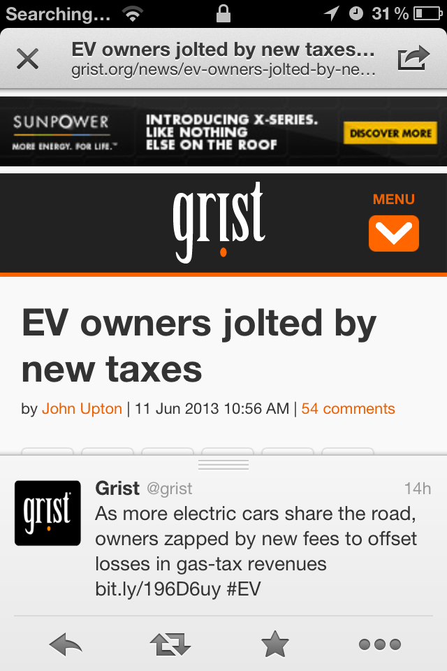
User Experience: Ensure that content provided by accessing a URI yields a thematically coherent experience when accessed from different devices.
Mobile Web Design
Testing: Carry out testing on actual devices as well as emulators.
Mobile Web Design
Content: Ensure that material that is central to the meaning of the page precedes material that is not.
Let's Develop It
- Update our mobile-first CSS to make our content appear most prominent on the page
- Change styles to make nagivation and header less prominent, and text content the main feature without user having to scroll. Design guideline
- Use the Media Query bookmarklet and Dev Tools to test your site on narrow screens and short screens
Mobile Web Design
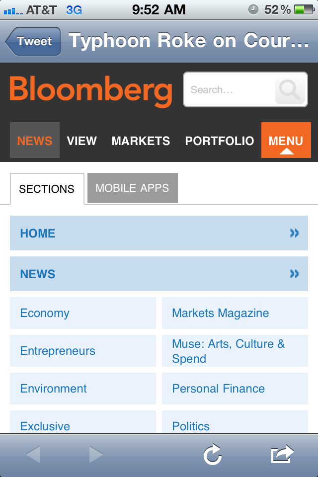
Navigation Best practices recommended by the W3C:
- Provide only minimal navigation at the top of the page.
- Provide consistent navigation mechanisms.
- Clearly identify the target of each link (e.g. no use of "Click here").
Provide only minimal navigation at the top of the page

Provide consistent navigation mechanisms

Clearly identify the target of each link
(no "Click here").

Navigation Patterns
(Responsive Nav Patterns)Navigating for Touch Devices
- Apple minimum tap dimensions: 44x44pts
- Windows Phone guideline dimensions: 32x32pts
- User experience research suggests even larger dimensions for fingers/thumbs: 72x72px
- Extra padding on links
- Extra space around links
Touch-friendly Navigation
Your controls need to facilitate touch interaction. This might mean giving links in content body extra padding so they’re easier to tap. This might also mean you need to add extra space between items in an ordered list of links.(Considerations for Mobile Design [Part 3: Behavior])
Touch-friendly Links
Touchable items should look like touchable items on handheld devices.(Considerations for Mobile Design [Part 3: Behavior])
Style nav links or callout links as buttons with borders, bolded text & background colors that stand out from other non-nagivation links and text.
Let's Develop It
- Use navigation best practices to make your nav menu touch-friendly and usable at small screen sizes.
- Use the "Nav Bar" or "Stacked List" design pattern to accomplish this for small screens.
- Use media queries to change the nav bar to match our original design at larger screen sizes where it fits the layout best.
Goal #4
Responsive Navigation
- Provide only minimal navigation at the top of the page
- Provide consistent navigation mechanisms.
- Should be touch-friendly with large, tappable buttons
Responsive Navigation
How do we reconcile these requirements?
Build a toggle menu that shows/hides our small screen nav on click/touch.
Writing JavaScript with jQuery
- jQuery is a JavaScript framework
- Learn more from Girl Develop It materials
- Easy to learn syntax and DOM manipulation
Let's Develop It
- Add jQuery to the bottom of your index.html file
- Inspect or View Source in your browser to make sure it's loading
jQuery Toggle
Toggle refers to showing/hiding element
Syntax looks like:
$('nav').toggle();jQuery Toggle
We want this toggle to show or hide our nav on alternate clicks so we put this toggle inside a click event:
$('.button').click(function() {
    $('nav').toggle();
});
Let's Develop It
- Add a button to your HTML (this will trigger the menu toggle!)
- Add the toggle event code to your page underneath your jQuery include (~line 135), inside a <script> tag:
<script>
$('.toggle-button').click(function() {
    $('header nav').toggle();
});
</script>
jQuery Toggle for Mobile Only
This toggle button should only show at small screen sizes, so hide it with CSS inside a media query for large screen sizes:
@media (min-width: 500px) {
.toggle-button {
    display: none;
  }
}
jQuery Toggle on Resize
What happens when we click our button to hide the nav, then resize our browser window to make it wider?
- Our button disappears!
- And our nav is still gone!
- Halp
CSS Media Queries to the Rescue
Take a look in the inspector and we see that the jQuery toggle just adds an inline style, which we can override with media queries to make our nav show on large screens:
@media (min-width: 500px) {
    .nav {
        display: block !important;
    }
}
Let's Develop It
- Add media queries to your CSS to hide the toggle-button and show the header nav for large screen sizes
- Style the nav as stacked for mobile first in your default CSS, then make it horizontal in your media query for larger screen sizes.
Bonus Nav!
- In your template file, check the js/menu folder for an example of the select menu design pattern.
- Open the template/js/menu/index.html file and resize to see it in action.
Performance Best Practices
Keep the number of externally linked resources to a minimum. Each linked resource (images, style sheets and other objects) requires a separate request across the network. This may add significantly to the load time of the page in the mobile context.
Solution: Use sprites for images, minify & combine CSS, minify & combine JS
Performance Best Practices
Limit content to what the user has requested. Mobile users often pay for bandwidth, so offering them content that is extraneous to their needs, especially advertising, costs them time and money and contributes to an unsatisfactory experience. In general, the user's consent should be sought before initiating the download of content.
Solution: If hiding content, use appropriate methods to NOT load the content if it's not going to be useful for mobile user. *P.S. If it's not useful for a mobile user, it's probably not useful for anyone. Consider getting rid of it for ALL devices*
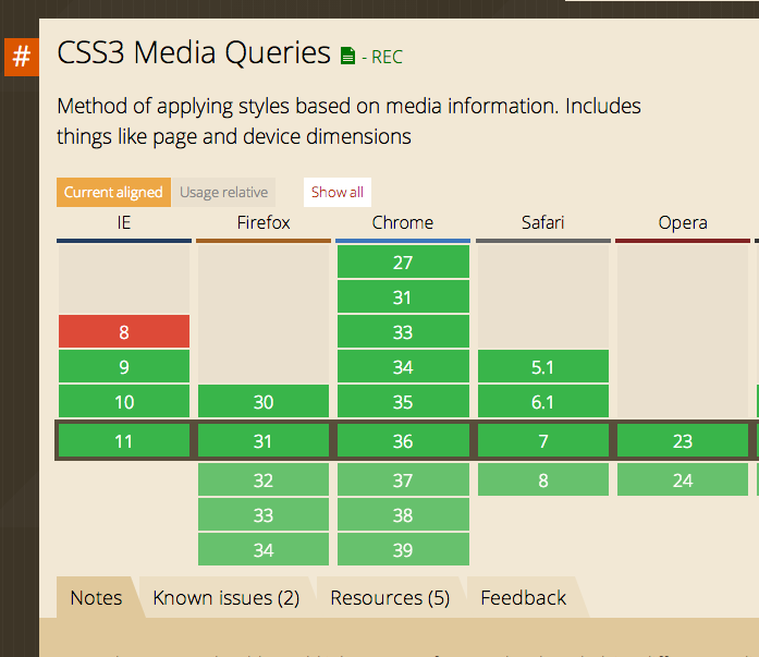
Browser Support
Check browser support for specific features at caniuse.com
Media Queries
What browsers support media queries?
Most, except old IE (IE8 and below)
Browser Support
Write CSS for specific features using Modernizr
Modernizr adds classes to the <body> element
- Classes let us style things differently for browsers that support certain features
- Includes classes for features like media queries, box-sizing, multiple bgs, background-size, box-shadow, font-face, gradients...etc
Let's Develop It
You should already have Modernizr built into your template, let's use it!
- Inspect the <body> element to see what classes it has
- Write styles using the .js class and the .no-js class so that your toggle navigation is styled with and without Javascript enabled
- Test by turning off JS in your browser (hint: useful Chrome plugin makes this easy)
- BONUS! Write styles using the .mediaqueries class or .nomediaqueries class to create fallbacks for IE. To do this, you'll have to add a new custom Modernizr script to your page.