Responsive Web Design
bit.ly/rwd-class-1 lee@girldevelopit.comWelcome!
Girl Develop It is here to provide affordable and accessible programs to learn software through mentorship and hands-on instruction.
Some "rules"
- We are here for you!
- Every question is important
- Help each other
- Have fun
Welcome!
Tell us about yourself.
- Who are you?
- What do you hope to get out of the class?
- What's something no one in this room knows about you?
Terms
-
Responsive DesignFluid grids + Flexible Images/Video + Media Queries
-
ViewportThe visible area of a webpage in a browser window
-
Mobile AppSoftware that is downloaded to a mobile device - we will not cover this.
-
Mobile websiteA separate website with its own domain built to target 'mobile devices', typically meaning smart phones. We're not covering this either.
Tools
-
Browser:ChromeFirefox
-
Development Toolkit:Chrome - InspectorFirefox - Firebug
-
Text Editor:
What is Responsive Web Design?
Responsive web design is an approach to web design in which a site is crafted to provide an optimal viewing experience—easy reading and navigation with a minimum of resizing, panning, and scrolling— across a wide range of devices (from desktop computer monitors to mobile phones).-Wikipedia
Examples
Why bother?
As of January 2017:
- 77% of American adults have a smartphone
- 42% own a tablet computer
- 32% own an e-reader
Goal #1
Four Keys to Responsive Design
- A Fluid Grid
- Flexible Images
- Media Queries
- Viewport Meta Tag
The Fluid Grid
- Define container widths as % instead of px
- Target ÷ context = result (Important - write this down!)
Target ÷ context = result
- Target = width you desire in pixels
- Context = the container of the element - a div or could be the viewport
- Result is a percentage value you can use as a width in your CSS
The Fluid Grid
The Fluid Grid
The Fluid Grid
.50
The Fluid Grid
50%
The Fluid Grid
The Fluid Grid
The Fluid Grid
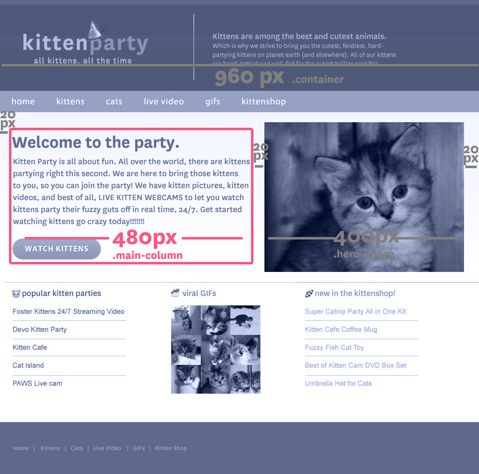
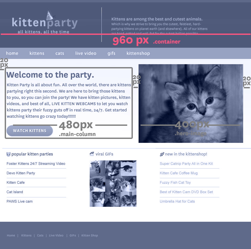
.container {
    width: 960px;
    margin: 0 20px;
}
.content .main-column {
    width: 480px;
    margin-right: 20px;
}
.content .hero-image {
    width: 400px;
}
The Fluid Grid
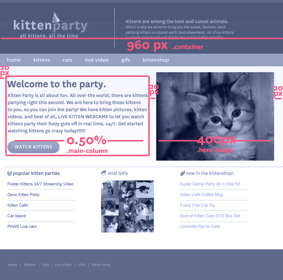
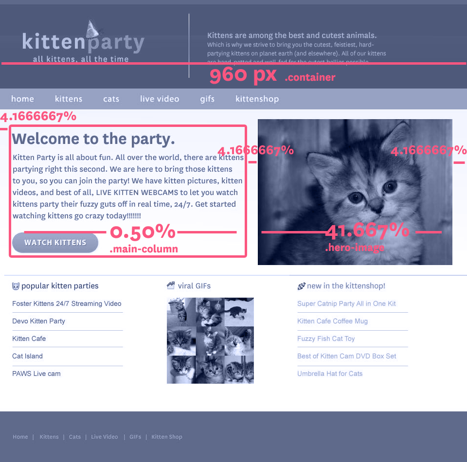
.container {
    width: 960px;
    margin: 0 4.1667%;
}
.content .main-column {
    width: 50%;
    margin-right: 4.1667%;
}
.content .hero-image {
    width: 41.667%;
}
Let's Develop It
- Open up your template index.html file in a browser
- Open style.css in the css folder in a text editor
- Make your page layout fluid!
- Hint: try this helpful calculator at rqrwd.com
.container {
width: 100%;
margin: 0 4.1667%;
}
.content .main-column {
width: 50%;
margin-right: 4.1667%;
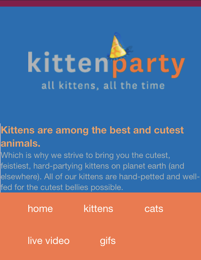
}Take a look on a "phone" or "tablet"
- In Chrome, open the Dev tools (View > Developer > Developer Tools) and follow these instructions
- In Firefox, select "Responsive Design View" from the Web Developer submenu in Tools or Menu list (See instructions)
Viewport <meta> Tag
Makes your page scale correctly on mobile devices.
<meta name="viewport" content="width=device-width">Uncomment line 18 in your index.html file and compare on a mobile device to see the difference.
Flexible Images
Like with fluid grids, percentages make images flexible in a page
img {
    max-width: 100%;
}
Let's Develop It
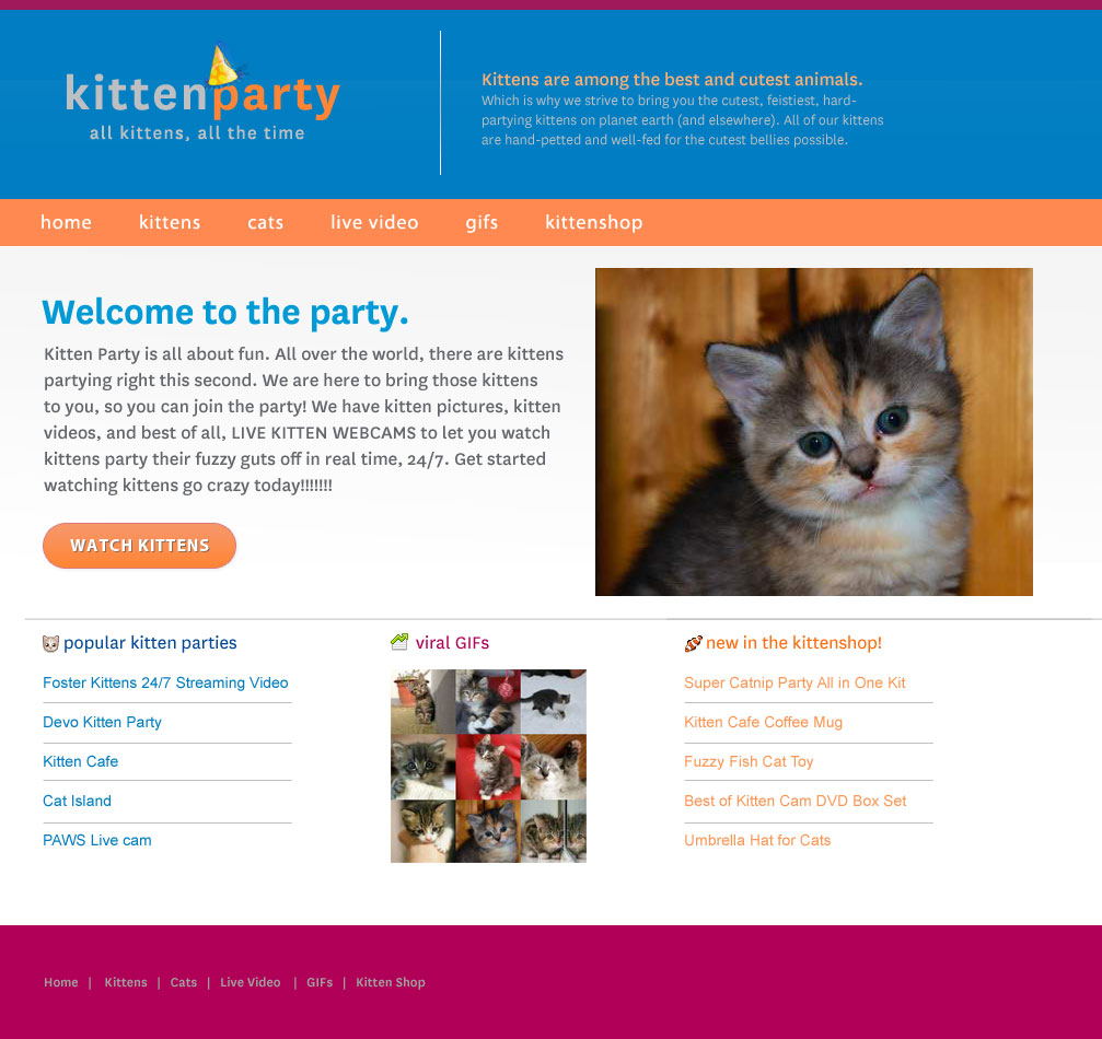
Find the following code in your hero-image div:
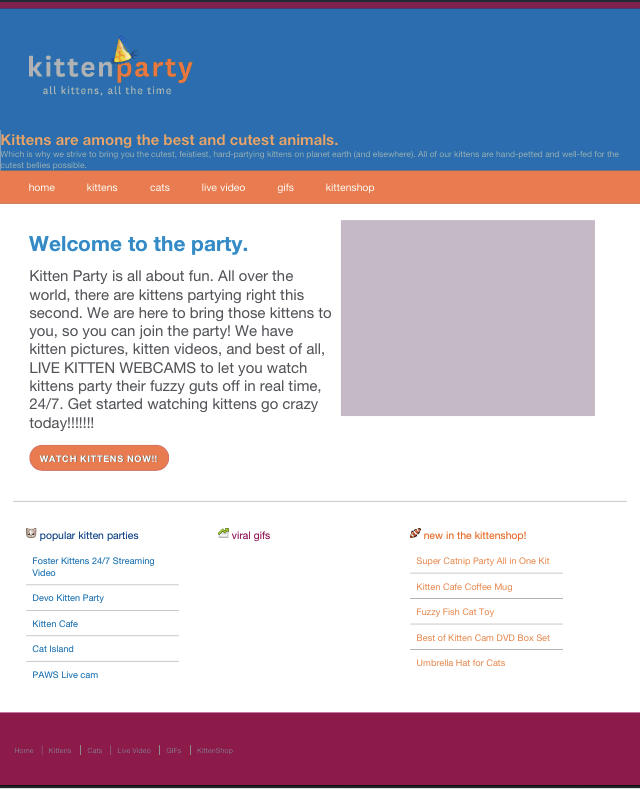
<img src="http://cdn3-www.cattime.com/assets/uploads/2011/08/best-kitten-names-1.jpg"
alt="pensive kitten">
What happens when you resize the page to make it small or big?
 img {
    max-width: 100%;
}
Flexible Images
What if you don’t want it to be 100% wide?
<img src="http://cdn3-www.cattime.com/assets/uploads/2011/08/best-kitten-names-1.jpg"
alt="pensive kitten"
class="small-image">
.small-image {
    float: left;
    width: 50%;
}
Let's Develop It
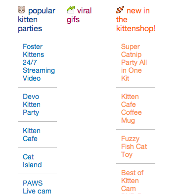
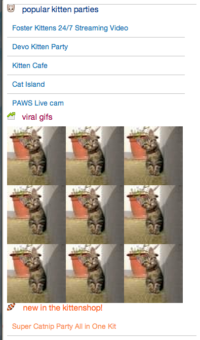
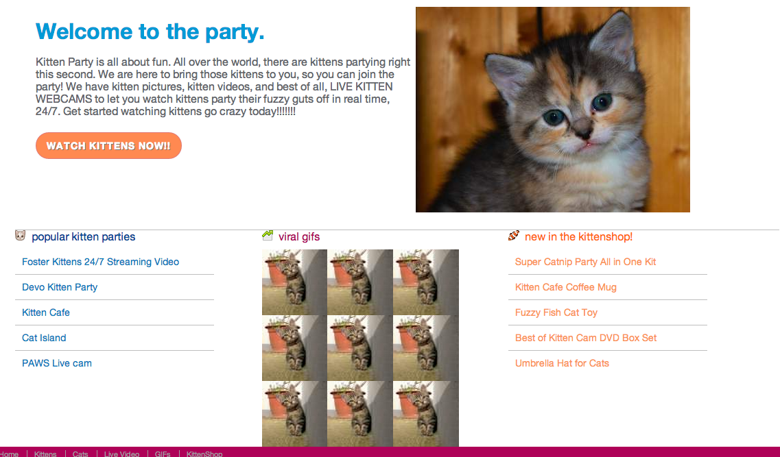
Using percentage widths & flexible images, add "Viral GIFs" photos to match our design:
- Use placekitten.com (or placepuppy.com if you must)
- Add 9 small images to your HTML
- Use floats + percentage widths in your CSS
The Fluid Grid
Q: For fluid grids, container widths should use ___? instead of pixels
A: Percentages
The Fluid Grid
Q: What is the formula to calculate your width percentage?
A: Target ÷ context = result
Viewport <meta Tag>
Q: The Viewport <meta> tag changes the _____? of your HTML document:
- Width
- Aspect Ratio
- Scale
- Height
A: C. Scale
Goal #2
Max Width Styles
For many responsive styles, you want to impose a maximum width on your elements that have percentage values:
.gifs img {
    width: 33%;
    max-width: 80px;
}
Let's Develop It
- Add max-width values to your elements with percentages.
- Hint: Use your old pixel width values for your max-width values. (Aren't you glad you kept those in a comment?)
.gifs img {
    width: 33%;
    max-width: 80px;
}
.container {
    width: 100%;
    max-width: 960px;
}
Fluid Video, etc.
- Video, slideshows, etc can also be made flexible
- For video: FitVids.js jQuery plugin
- Or, just add a max-width: 100% (or other value)!
Let's Develop It!
- Find a cute cat video on Youtube.com
- Add the embed code to your HTML
- Add a flexible width and a max-width to the YouTube element
.container {
    width: 100%;
    max-width: 960px;
}
Media Queries
Media Queries apply CSS based on conditions that you decide (usually width, but can also be resolution, device size, height, media type).
@media print {
  * {
    background: white !important;
  }
}
@media (min-width:600px) {
  header {
    /* styles for only 600px wide & up */
  }
}
Let's Develop It
Change your header element's background color so it's red at screen sizes larger than 600 pixels.
header {
  background: #0580C3;
}
@media (min-width:600px) {
    header {
        margin: 0 ??% 0 0;
        width: ???%;
        float: left;
  }
}
Hmm...
Where do you put your media queries??
- At the bottom of your stylesheet
- After your mobile-first CSS but before your Print styles
- After each element that needs a media query - you can have multiple media queries, even of the same type!
- For Mobile First sites, always after your default CSS!
- With min-width, in order by small to large values
Media Queries
Just like with a print stylesheet, you can add media queries based on screen size to any element you want:
Media Queries
Most important elements to target with media queries are usually layout-related, like your fluid grid styles.
.container {
    margin: 0 auto;
    width: 100%;
}
@media (min-width:960px) {
    .container {
        width: 960px;
    }
}
Fluid Grid Problem!
Sometimes our fluid grids are too small to fit our content nicely in our design at small screen sizes:
Let's Develop It
Fix your squished grid callout styles:
- Move your .callout divs' width and float styles inside a media query
- Fix styles as needed for your default CSS
.callout { width: 100%; }
@media (min-width:960px) {
    .callout {
        margin: 0 ??% 0 0;
        width: ???%;
        float: left;
  }
}
Callout Divs Stacked
Here's how our callout divs should look now, without floats or widths on the left, and with floats and widths on the right:
Media Queries
Media queries can also use:
- em values instead of pixels
- max-width
- min AND max-width parameters
- resolution parameters
- many more
Media Queries with Ems
Convert pixel values to ems with pxtoem.com
@media (min-width:60em) {
    .container {
        width: 100%;
        max-width: 960px;
    }
}
Media Queries using Max-Width
Use multiple parameters to target in-between sizes (aka breakpoints)
@media (min-width:700px) and (max-width: 800px) {
    .nav {
        font-size: 110%;
    }
}
Let's Develop It
Make your .content div yellow between 700 and 800 pixels wide only, and green above 800 pixels
@media (min-width:700px) and (max-width: 800px) {
    .content {
        background-color: green;
    }
}
Let's Develop It
Make a mobile-first responsive site:
- Move ALL your floats & widths into a media query for 960px wide viewports and up.
- Add mobile first styles for your CSS that's not inside a media query: widths, padding, floats as needed, etc.
- Resize browser to see your media queries kick in at the larger screen size.
Breakpoints
The points in your layout where you add a media query, or where things shift and change.
/* this is a 60em or 960px wide breakpoint */
@media (min-width:60em) {
    .container {
        width: 100%;
        max-width: 960px;
    }
}
???
How do you know what breakpoint you're looking at??
- Inspector and Dev Tools to the rescue!! Resize with your inspector open to see the viewport size in pixels
- Add the Media Query bookmarklet to your browser!
Breakpoints
These can be based on popular device sizes, like iPhone, iPad and desktop resolutions:
.container { width: 100%; }
@media (min-width:320px) {
    .container {
        margin: 0 auto;
        width: 320px;
    }
}
@media (min-width: 768px) {
    .container {
        width: 768px;
    }
}
@media (min-width: 960px) {
    .container {
        width: 960px;
    }
}
Example: Eataly
Breakpoints
Breakpoints can also be more fluid, and added only where the layout starts to look funky:
.hero-image { width: 100%; }
@media (min-width:530px) {
    .container {
        float: left;
        width: 41.6666666666667%; /* 400px/960px */;
    }
}
Example: BohConf
Let's Develop It
- Add media queries for breakpoints that are the size of popular mobile devices (phones, tablets, etc)
- Look up these screen resolutions - try looking up your own devices
- Try changing the widths at these breakpoints to mimic the rigid grid layouts we looked at.